
01
Exploring the range
The category-led shopper
They may not know the exact product name. Illustrated categories help them narrow a broad catalogue into a manageable starting point.
A WooCommerce catalogue that brings a broad food range into a clear category system and keeps essential comparison and ordering actions close to each product.
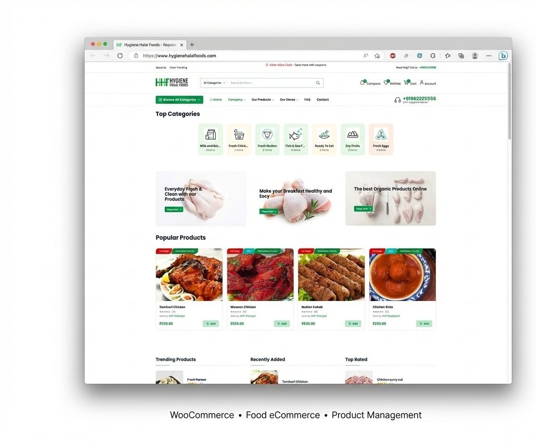
A food store can become difficult to scan when fresh items, ready-to-eat products and pantry categories all compete for attention. The interface needed a strong browsing order while preserving direct access to search, account, cart and customer support.
Can I find the right category, compare what matters and add it without losing my place?The human question the interface needed to answer
They may not know the exact product name. Illustrated categories help them narrow a broad catalogue into a manageable starting point.
They scan names, prices and product actions quickly. Consistent cards keep those decisions predictable from one item to the next.
These scenarios explain the design intent visible in the confirmed catalogue; they are not presented as customer research findings.
Illustrated category shortcuts make the product range understandable before shoppers commit to a long catalogue page.
Consistent product cards keep imagery, names, prices and add actions in repeatable positions across the grid.
Search, comparison, wishlist, cart, account and telephone support remain visible as shoppers move through the store.
The storefront helps people begin with a category, compare products in a repeated pattern and act without searching for the next control. Utility leads because everyday shopping rewards speed and predictability.
Category shortcuts give people an immediate sense of where different foods belong.
Product name, price and add action stay together from one card to the next.
Search, account and basket tools remain accessible throughout the catalogue.
A candid measure of the workWe can show how the interface reduces avoidable shopping friction. Sales and repeat orders depend on inventory, fulfilment, pricing and service too, so no unverified commercial result is presented here.