
01
Needs guidance
The uncertain first-time shopper
They begin with a skin or hair concern, not a product name. The consultation route gives them a meaningful first step before asking them to shop.
A consultation-led WooCommerce storefront that connects skin and hair concerns with clear next steps, while keeping the shopping experience calm and approachable.
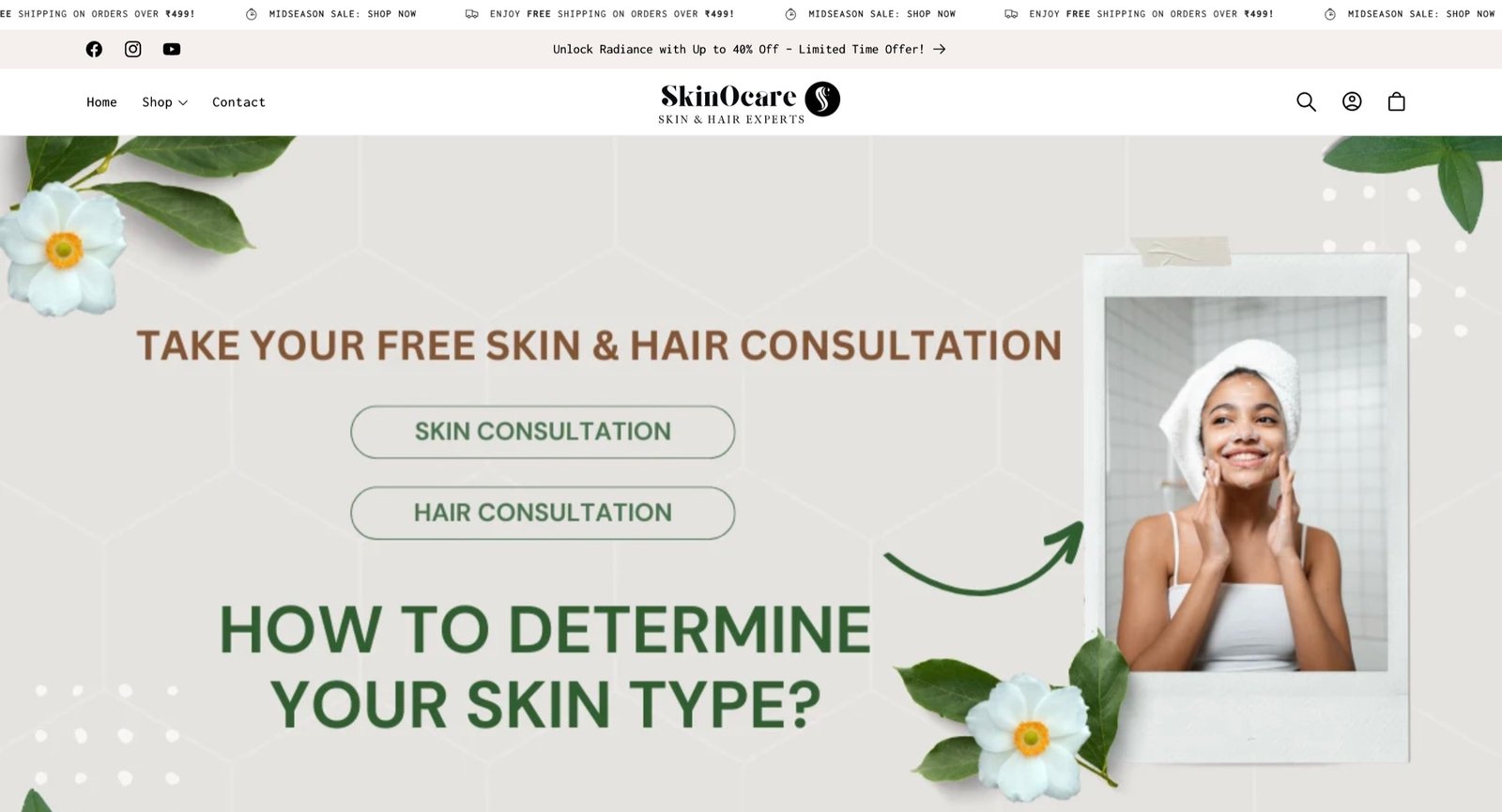
Skin and hair shopping often begins with uncertainty rather than a specific product name. The interface therefore needed to support two related paths: visitors ready to browse the store and visitors who first needed help understanding what suited them.
What should I choose for my concern—and can I trust that I am starting in the right place?The human question the interface needed to answer
They begin with a skin or hair concern, not a product name. The consultation route gives them a meaningful first step before asking them to shop.
They want familiar search, account and basket controls so they can move directly to products without repeating an advisory journey.
These are design scenarios based on the confirmed storefront and consultation scope, not claimed interview participants or testimonials.
The opening view gives skin and hair consultations clear, separate actions instead of forcing every visitor immediately into a product grid.
Search, account and basket controls remain recognizable so the advisory layer does not make routine shopping harder.
Natural imagery, generous spacing and restrained color help the interface communicate care without losing the clarity expected from a specialist service.
People who need guidance can begin with a consultation. People who already know what they want can continue through familiar shopping controls. Neither path has to get in the other’s way.
Visitors can choose skin or hair guidance before confronting a full product catalogue.
Search, account and basket controls remain where an experienced shopper expects them.
The same priorities remain understandable as the experience moves from desktop to phone.
A candid measure of the workOur role was to remove avoidable uncertainty from the interface. Great advice, products and ongoing customer care determine the longer relationship, so we do not attach invented revenue or conversion figures to the design.