
01
Learning before buying
The curious first-time visitor
They need product names, types and brand character to work together so the catalogue feels understandable rather than interchangeable.
A product-led WooCommerce experience that gives natural honey varieties, related products and current offers a direct path from discovery to purchase.
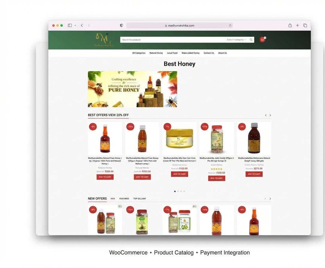
Natural honey is not one undifferentiated item. The storefront needed to expose product types, quantities and offers clearly while keeping the sourcing-led character of the brand visible throughout the buying experience.
What makes these varieties different—and which quantity or offer makes sense for me?The human question the interface needed to answer
They need product names, types and brand character to work together so the catalogue feels understandable rather than interchangeable.
They compare quantity, price and offers. A repeated card pattern keeps those practical details close to the purchase action.
These are design scenarios inferred from the confirmed catalogue and purchase flow, not attributed customer testimony.
A prominent product search and category control helps returning customers move directly to a known item or type.
Consistent cards expose product image, name, quantity, price, discount and add-to-cart action in one repeatable pattern.
Green and warm red distinguish the natural-products identity, navigation and commercial actions without obscuring product information.
The storefront keeps brand character close to practical buying information. People can explore the range without losing sight of quantity, price, current offers or the action needed to purchase.
Navigation gives different honey and related product types recognizable places.
Quantity, price and discount information follow a consistent visual rhythm.
Add-to-cart actions remain attached to the product being considered.
A candid measure of the workOur goal was to make the range easier to understand and buy. Product quality, fulfilment and customer relationships shape long-term sales, so this story stays focused on the interface we can verify.